Case study · Product Design
Improving Product Adoption at BlueOptima’s Predictive Assessment Platform
Designing a guided onboarding and tooltip-based product tour to help recruiters and hiring managers create job roles with confidence.
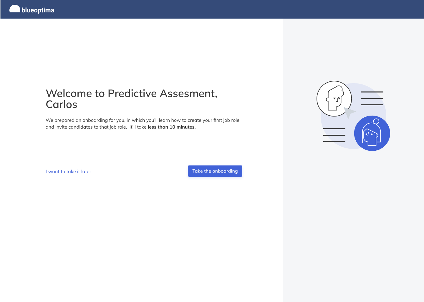
A live onboarding experience focused on reducing early setup friction and supporting long-term adoption by guiding users step by step through job role creation.
This onboarding flow was shipped and used in production. Due to changes in access over time, detailed post-launch metrics are not included. This case study focuses on problem framing, design decisions and the shipped solution.
Project snapshot
At a glance
Success definition
Context
The problem
While BlueOptima’s Predictive Assessment offered powerful insights, long-term adoption depended on users successfully setting up and maintaining job roles—a critical step early in the experience.
For technical recruiters and hiring managers, job role creation required making decisions with limited guidance and confidence that the setup was correct before inviting candidates.
- High cognitive load during first-time setup.
- Limited contextual guidance when defining job roles.
- Unclear next steps after entering the platform.
- Different needs between new vs returning users.
Goals
What we aimed to improve
- Improve early product adoption by reducing setup friction.
- Help users successfully create their first job role.
- Increase confidence in product value early on.
- Support long-term retention through a stronger first experience.
- Provide guidance without overwhelming users.
- Adapt to different user states (new vs returning).
- Teach the interface in context.
- Maintain user autonomy (skip/exit).
Solution
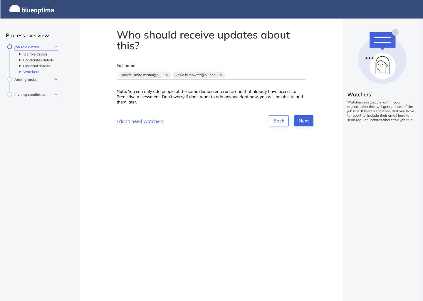
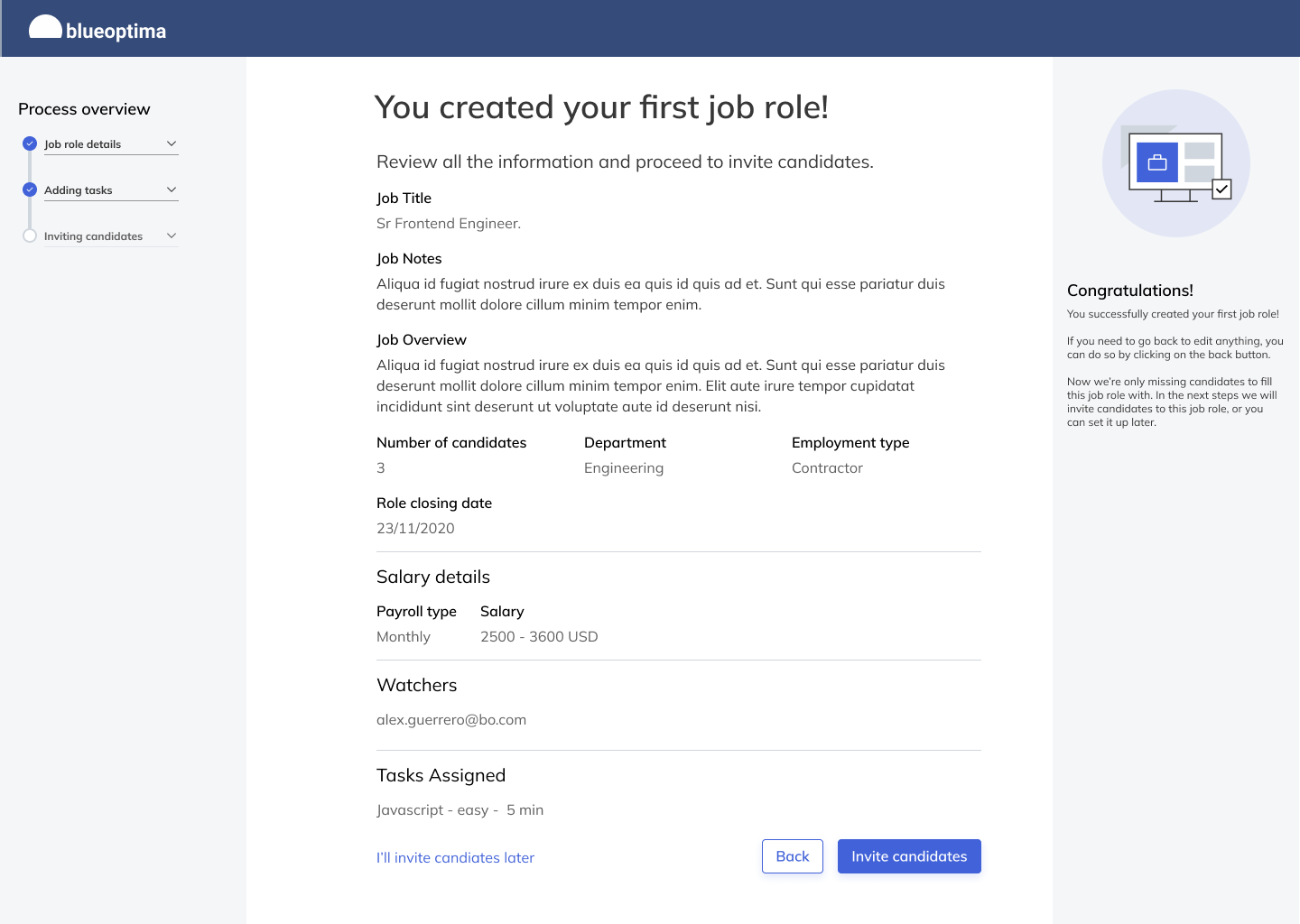
Guided onboarding + tooltip-based product tour
The solution combined a guided onboarding flow (task completion) with an in-product tooltip tour (interface learning). Together, they supported different user states and guided users toward the activation moment: creating a job role.
If you have wireframes, prototypes and feedback analysis boards, you can add them here as full-width figures to strengthen the process narrative.
Design decisions
Key choices and trade-offs
Onboarding was designed as an adaptive system to support different entry points and user states, rather than a single linear walkthrough.
Tooltips kept users in context and minimized disruption while teaching key UI areas during real usage.
Complex decisions were broken into smaller steps to reduce cognitive load and build confidence gradually.
Users could skip or exit onboarding to avoid frustrating returning users or interrupting workflows.
Feedback
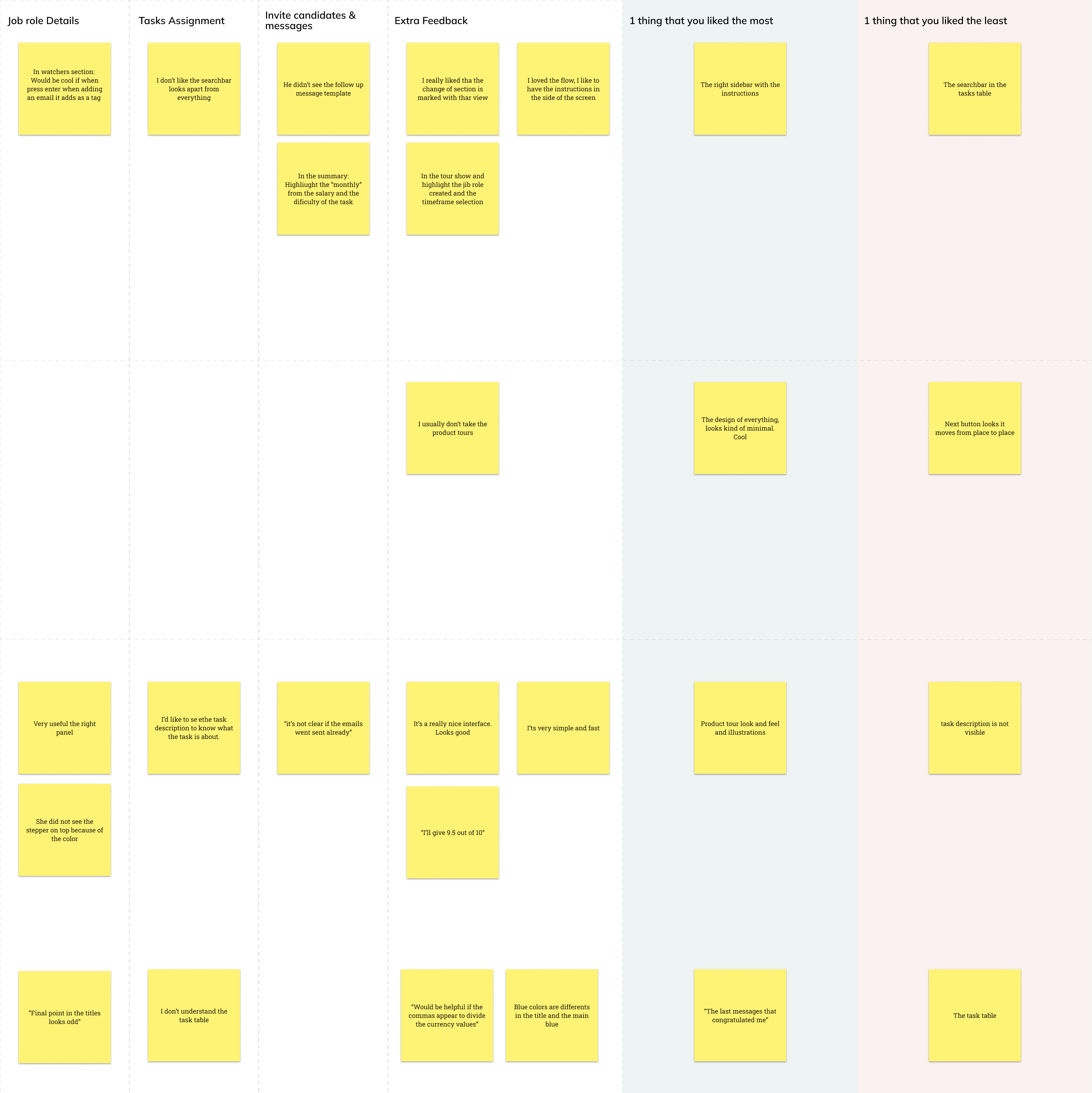
Testing and analysis
I ran two feedback/analysis sessions to validate clarity, comprehension and the perceived helpfulness of guidance. Key themes informed refinements to copy, sequencing and tooltip density.
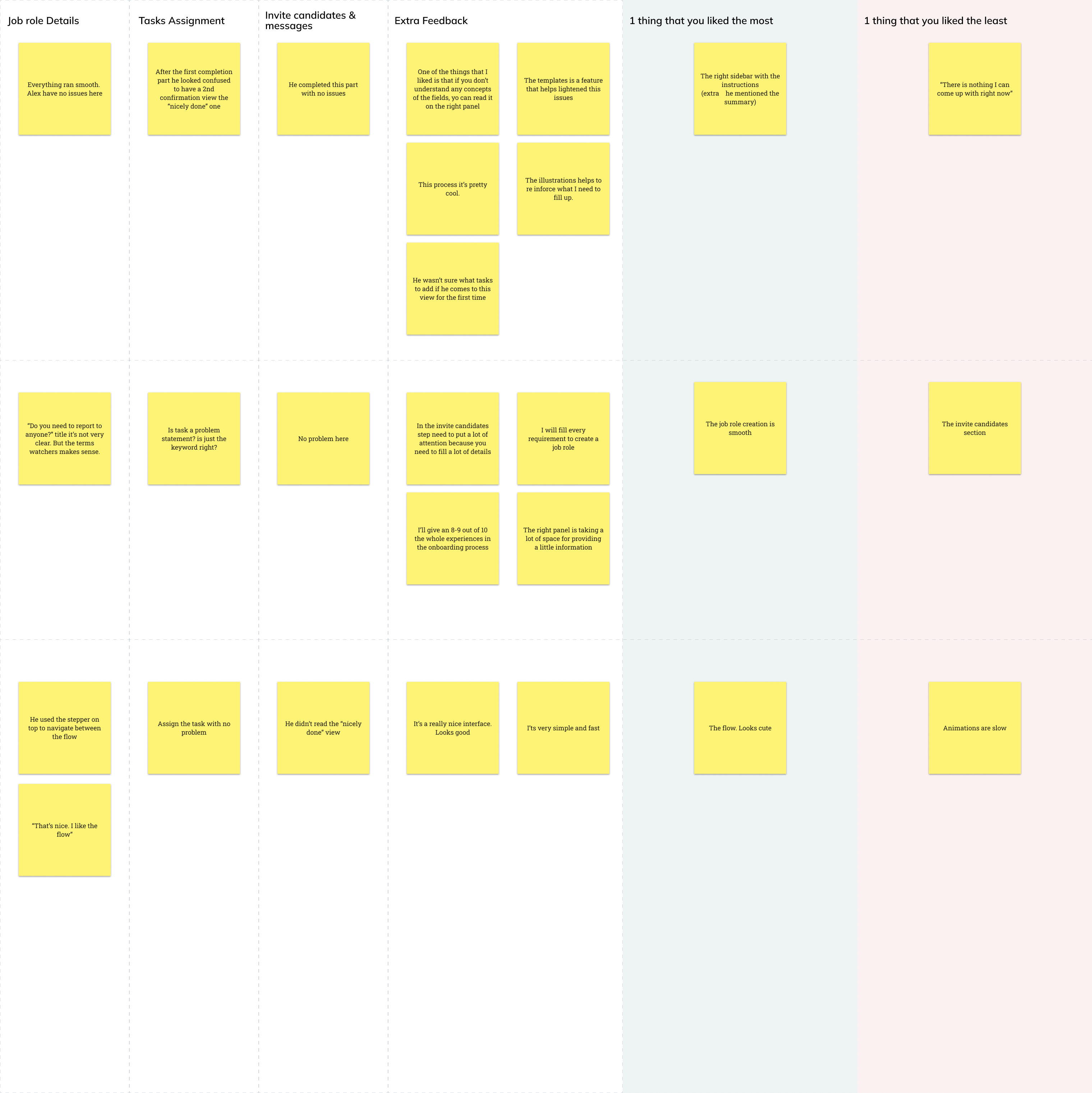
Learnings
- Adoption is a product problem, not just usability.
- Contextual guidance works best when optional and progressive.
- Different user profiles need different levels of help.
- Reducing uncertainty can be as important as simplifying UI.
Next steps (what I would measure)
- Job role creation completion during onboarding.
- Drop-off points inside onboarding and the tooltip tour.
- Time to first meaningful action after login.
- Tooltip usage and dismissal patterns.
Next
Technical Interview Platform Redesign
Contact
petemugartegui@gmail.com
Based in Paris, France 🇫🇷
Open to work worldwide.
© 2025 Pedro Mugartegui · Portfolio hand-coded with love ❤️


